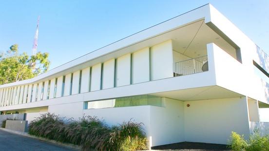
With a long span of angled panels lining its futuristic facade, the Caverhill house looks monumental, almost imposing. But pass through the front gate and enter the main living area, and one feels a remarkable sense of air and light. Diffused rays filter through the narrow, transparent panes tucked between those panel “fins,” as the architect calls them, and softer sunlight streams through the floor-to-ceiling glass forming the rear wall.
At a time when so many people are looking for an escape from reality, the home of Don and Debbie Caverhill certainly provides one. After a 1 1/2 -year design process and another 1 1/2 years of construction, the home by Culver City-based Studio Pali Fekete Architects now stands as a contemporary indoor-outdoor replacement for the old house that once stood on the difficult site.
Because of hillside building ordinances and a desire to keep the previous structure’s footprint (think a slice of pie), making the most of the property was a challenge.
“The slope of the hill is not parallel to the street,” architect Zoltan Pali says. “It wedges, so you get a wedge-shaped plan.”
The main entrance is on the second of three levels, where the living room flows freely to the kitchen and dining area. These communal spaces are complemented by ample covered terraces and balconies — more than 1,000 square feet in all throughout the house. Each cove is protected from the sun and wind but still open to views.
“The first thing we wanted was for the space to feel good — to be a place where you wanted to hang out — but it still had to be thoughtful and peaceful,” says Caverhill, who has experienced outdoor living areas that seem fine until “the sun burns a hole in your head.”
“We wanted something that was a real outdoor room that didn’t bake you,” he says.
The front exterior fins (see Page E1) screen the house from afternoon sun as well as passing cars. Inside, the openness of the design can be credited to steel framing, which frees rooms of interior walls or vertical supports.
“You can see all the way down from one side of the house to the other,” Caverhill says. “It’s hard to get it that simple.”
Simplicity, in fact, was a goal. All the house controls — heating, cooling, lighting, window shades, security and more — are contained within a control panel near the front door. Ductwork was eliminated by the use of an Airfloor System, which heats or cools rooms through a series of dome-like structures beneath the micro-finished concrete floor surface. The countertops have the streamlined beauty of Caesarstone quartz, and the cabinetry is horizontally laid bamboo.
“People ask me if we used bamboo because it’s green,” Caverhill says. “No. It’s because veneer bamboo is fine enough to be like a graphic; it’s very uniform, but you still get a wood feel because of the color variation.”
Stairs lead to the top floor, which has the master bedroom and a terrace at one end of the house and a garret-like guest room at the other. Here, all the cabinetry also is bamboo. Each unit floats above the floor, the electrical outlets tucked below, out of sight. At every turn — including the bathrooms, whose wedge shape echo the house as a hole — the finishing details are spare but certainly not spartan.
“In Japanese painting you have one brush stroke that gets branch, leaves and flowers,” Caverhill says. “That’s what we were hoping for — to have less things do a whole lot more.”
The lowest level of the house, set on the slope below street level, has two more guest rooms, a lawn and a patio with a long fire pit running toward an infinity pool. The view from down here reveals the size of the home — more than double its 1,750-square-foot predecessor — as well as its openness, an attribute that one might not suspect given the house’s unusual presence on the street.
“I love the fact that it’s a shell that wraps up like a ribbon,” Caverhill says. “When you look at an aerial photograph, and you see all the other roof lines, this looks like it was dropped in from Andromeda.”
Article By: Chris Iovenko
